Understanding the Browser's Layout Engine: Formatting Contexts, Stacking, and Compositing Explained
by Syed Sibtain, System Analyst
Introduction
Every developer eventually reaches the point where we add z-index: 9999, and it still doesn’t appear on top. We set a margin-top, and it unexpectedly collapses. Or our animation drops frames for no apparent reason. That’s when we realize the browser isn’t just displaying boxes—it’s running a real-time layout engine, making thousands of geometric decisions every second.
Modern browsers are visual machines. They build multiple trees, establish layout rules, decide stacking order, and offload work to the GPU—all within roughly 16 milliseconds per frame to keep our interfaces smooth at 60 fps.
In this article, we’ll look under the hood together, exploring how formatting contexts, stacking, and compositing quietly shape how every interface we build is rendered on screen.
By the end, we’ll have a deep understanding of:
- How the browser’s layout engine builds and positions every box
- How formatting contexts (
block,inline,flex,grid) isolate and structure layouts - Why stacking contexts control depth — and why
z-indexsometimes lies - What triggers reflow and repaint, and how to avoid costly layout thrashing
- How the browser composites layers on the GPU for smooth, 60fps experiences
1. Formatting Contexts
1a. The Visual Formatting Model — How Layout Begins
Before anything is displayed, the browser must decide how elements will interact and take up space. That entire decision-making process happens inside something called the visual formatting model—the set of rules that defines how boxes are generated, sized, positioned, and painted.
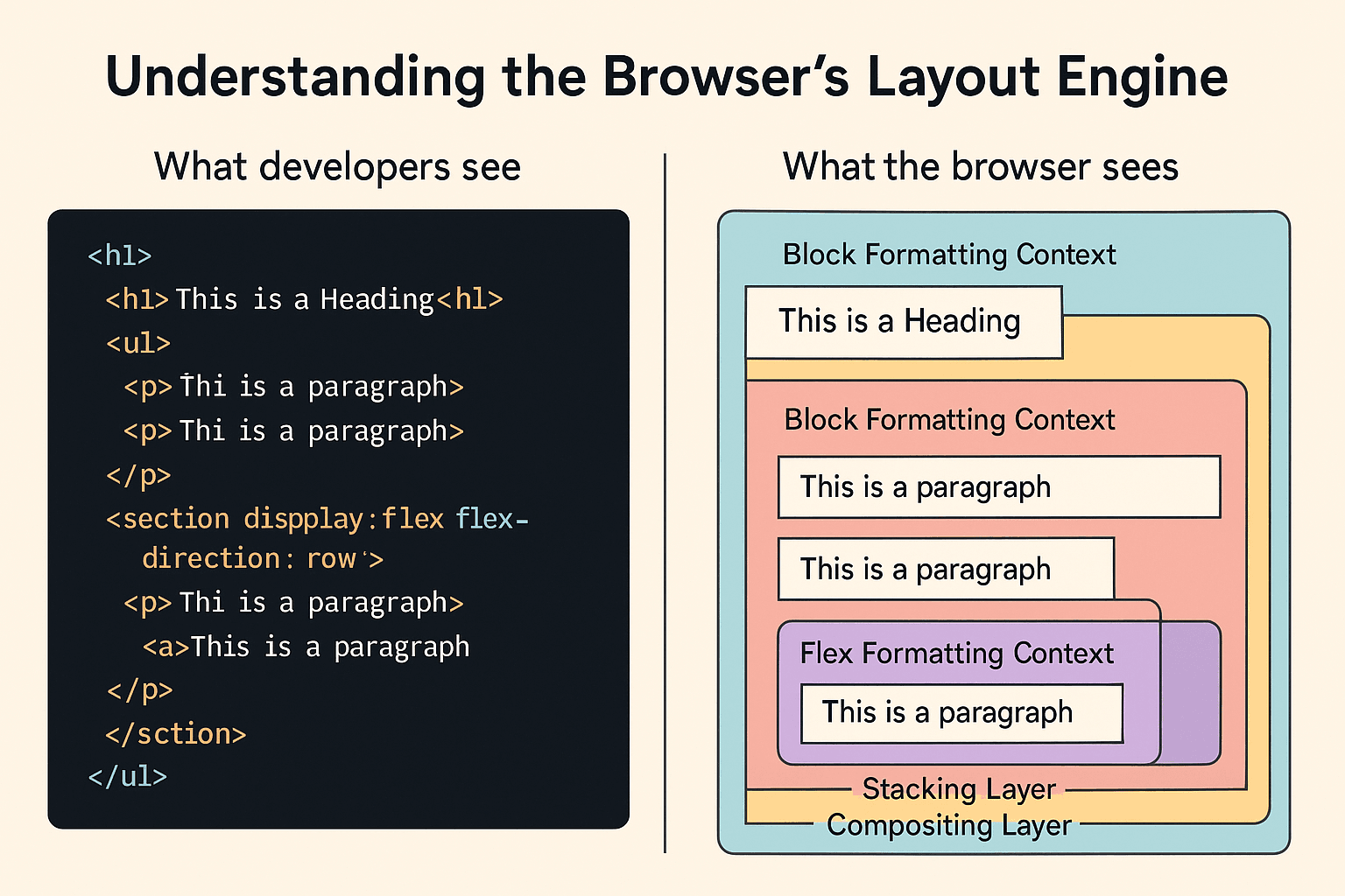
What Is a Browser Formatting Context?
A formatting context is the layout environment that the browser creates for a group of boxes. Think of it as the "coordinate system" or "ruleset" that governs how children behave within a container.
Every element in the page lives inside one of these contexts—it's how the browser knows whether elements stack vertically, line up horizontally, float, or grid themselves into place.
The Browser's Visual Formatting Model (VFM)
The Visual Formatting Model is the overall mechanism within the browser's layout engine that determines all formatting contexts. It's part of the rendering pipeline—right after style computation and before layout.
The VFM model decides:
- How boxes are generated from the DOM (e.g., block boxes, inline boxes, flex items, and grid items).
- Which layout rules apply inside each environment (
block flow,inline flow,flex, orgrid). - How boxes interact vertically and horizontally (stacking, collapsing, line wrapping).
- How containing blocks are formed for positioned elements.
Each formatting context (block, inline, flex, or grid) is a subset of the VFM model—a specialized environment with its own internal rules.
When and How the Browser Creates a Formatting Context
Formatting contexts are not something we explicitly "declare." The browser automatically creates them during the layout phase (reflow) of the rendering pipeline.
Here's a simple overview of what happens inside the rendering pipeline:
- DOM construction → The browser parses our HTML and builds a content tree.
- CSSOM construction → CSS is parsed and stored as a style tree.
- Render tree creation → The DOM and CSSOM are merged, skipping non-visual elements like
<head>or<script>. - Formatting context initialization → The layout engine now decides which elements create new formatting contexts.
- The root element (
<html>) creates the root formatting context. - As the engine walks the tree, elements that trigger new layout rules (like
display: flexoroverflow: hidden) generate new formatting contexts.
- The root element (
- Layout (reflow) → Inside each formatting context, the engine computes box geometry based on that context's internal rules.
- Paint (repaint) → The engine paints the boxes to the screen, composited by the GPU if needed.
- Compositing (GPU) → Finally, the painted layers are uploaded to the GPU and composited together into the final frame that we see on the screen. We will discuss this in more detail in section 3.
So, in a sense, the browser automatically creates formatting contexts during layout — they're not "CSS features" we can toggle on or off, but natural by-products of how the browser structures space. And it doesn't matter what framework or library we use — React, Vue, Svelte, or even Rails with ERB — the browser's layout engine still follows the same rules underneath.
1b. Types of Formatting Contexts
Now that we understand the purpose of formatting contexts, let's explore the four primary types that power each layout we create:
- Block Formatting Context (BFC)
- Inline Formatting Context (IFC)
- Flex Formatting Context (FFC)
- Grid Formatting Context (GFC)
Block Formatting Context (BFC)
A Block Formatting Context (BFC) is the foundation of CSS layout. It's essentially a layout island—a self-contained environment where block-level boxes stack vertically and don't interfere with elements outside.
When a BFC is created:
- When an element is floated (
float: left | right) - When
overflowis anything other thanvisible - When
displayisflow-root,inline-block, ortable-cell - When
positionisabsoluteorfixed - When
contain: layout | contentis applied
Inside a BFC:
- Boxes are stacked top to bottom.
- Floats stay contained and don’t leak out.
- Margins between this context and outside elements don’t collapse.
Example:
html
<div class="wrapper">
  <div class="float-box"></div>
  <div class="bfc-box"></div>
</div>
css
.wrapper {
  border: 1px solid #ccc;
}
.float-box {
  float: left;
  width: 100px;
  height: 100px;
  background: lightblue;
}
.bfc-box {
  overflow: hidden; /* Creates a BFC */
  height: 100px;
  background: pink;
}
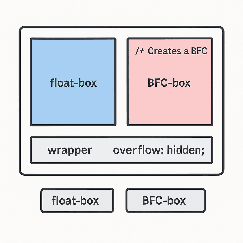
Without overflow: hidden, the pink box might slide under the float. Here, the .bfc-box establishes a new BFC because of overflow: hidden. That means it sits neatly beside the float instead of being overlapped by it.
Inline Formatting Context (IFC)
If BFC handles blocks, IFC handles text and inline content. Whenever we write a paragraph or span of text, the browser creates an Inline Formatting Context. It's how text flows naturally within its container. We've all seen it every time a long sentence wraps naturally.
Every block container element creates an inline formatting context for its text content — so even a simple <p> has one inside its BFC.
Inside an IFC:
- Inline boxes (text, spans, images) flow horizontally
- When they reach the container edge, a new line box begins
- Vertical alignment (
baseline,middle,text-top, etc.) is based on font metrics
Example:
html
<p>Hello <strong>world</strong>, welcome <em>home!</em></p>
All of these inline boxes exist in the same IFC, wrapped into multiple line boxes as needed.
It's why vertical-align: middle doesn't quite center text visually — the browser's aligning baselines, not bounding boxes.
Flex and Grid Formatting Contexts — The Modern Layout Engines
Modern CSS layout systems introduced new formatting contexts that replaced many float and positioning hacks. Flexbox and Grid introduce their own formatting contexts — complete layout algorithms designed for predictability.
Flex Formatting Context (FFC):
When an element is set to display: flex, the browser creates a flex formatting context — a one-dimensional layout environment.
- Elements align along a main axis (row or column).
- Margins don’t collapse.
- Floats are ignored.
- Items can grow or shrink to fill space.
Flexbox gives predictable control for linear layouts — navigation bars, cards, lists, etc.
Grid Formatting Context (GFC):
With display: grid, the browser creates a grid formatting context — a two-dimensional layout system.
- The container defines explicit rows and columns.
- Items snap into grid cells.
- Margins don’t collapse, and floats have no effect.
- The browser calculates track sizing using min/max rules, fractions (
frunits), and content-based sizing.
Grids give full two-dimensional control — ideal for dashboards, galleries, and adaptive layouts.
In short, BFC and IFC are implicit contexts (browser decides), while FFC and GFC are explicit contexts (we decide).
2. Stacking and Positioning
2a. Stacking Context — The Browser's Z-Axis
So far, we've looked at how the browser arranges elements in space—how boxes line up vertically and horizontally inside their formatting contexts. But layout only defines where elements sit in two dimensions.
Once layout is complete, the browser needs to decide which element paints on top — that's where stacking contexts come in. These are invisible 3D layers that define depth, ensuring elements are painted in the correct visual order.
What Is a Stacking Context?
Think of a stacking context as a 3D layer system. Each element is assigned a layer, and the browser decides which layer appears on top of which. A stacking context follows z-index rules and allows items to be painted relative to one another, but cannot overlap or break out into a parent context. If we've ever set z-index: 9999 and still didn't come out on top, here is why.
Our element is inside a completely distinct stacking environment. It's like being in a different room — no matter how high our z-index, we can't step outside that room's walls.
When Is a New Stacking Context Created?
The browser creates a new stacking context when any of the following conditions are met:
- A positioned element (
relative,absolute,fixed) has az-indexvalue other thanauto - An element has
opacity < 1 - A
transform,filter, orperspectiveis applied isolation: isolateormix-blend-mode(non-normal) is usedwill-changereferences any of these properties (transform,opacity, etc.)
Some browsers also create stacking contexts for elements with contain: paint or content-visibility: auto
Each of these properties tells the browser to treat this element and its children as an independent paint layer.
How Stacking Works
The browser paints elements in a specific order called the stacking order, roughly as follows:
- The background and borders of the root element
- Elements with negative
z-index - Non-positioned elements (normal flow)
- Positioned elements with
z-index: autoor0 - Positioned elements with positive
z-index
Within a single stacking context, this order determines how elements overlap. But once an element forms a new stacking context, it and all its descendants are painted as a single unit — above or below other contexts, but never mixed in between.
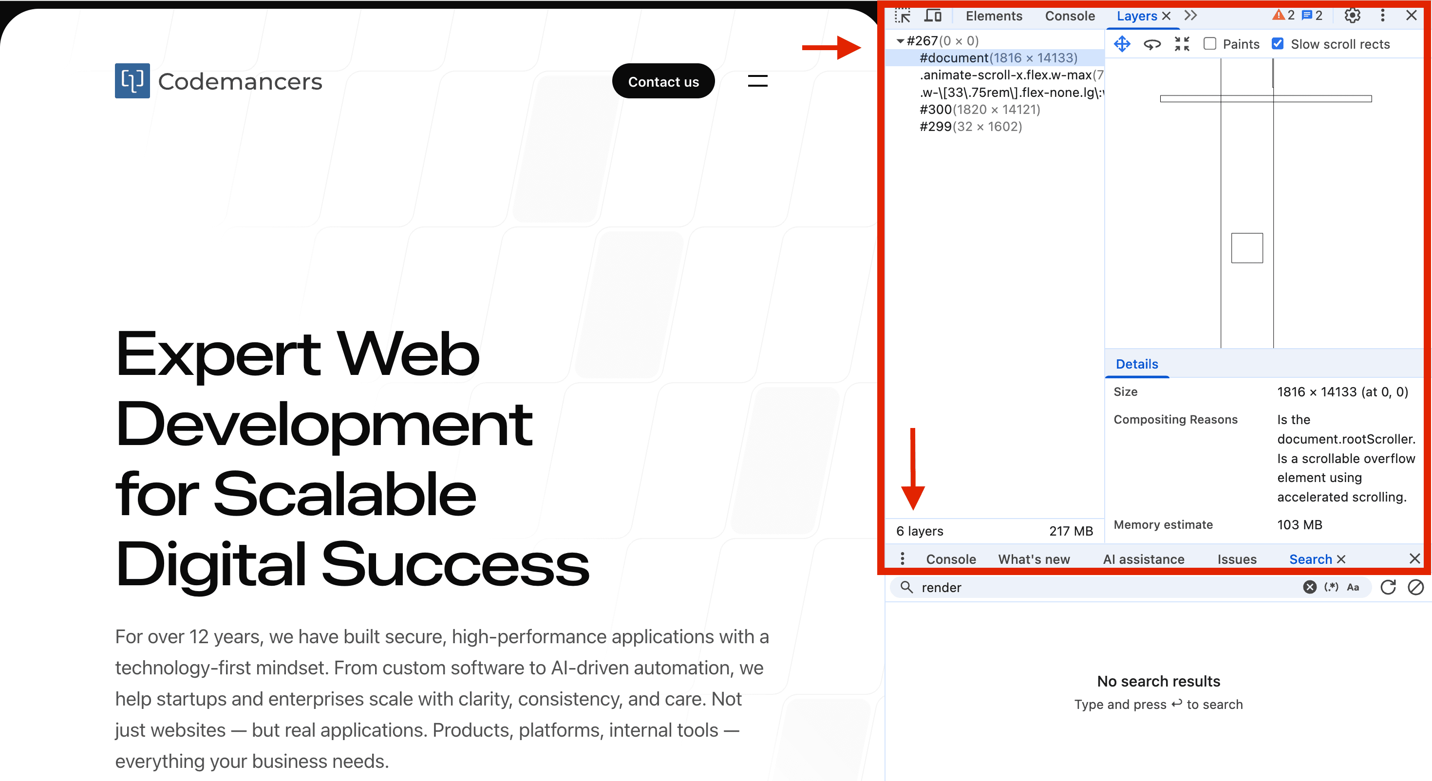
If we want to visualize the stacking order, we can check the "Layers" tab in DevTools. We'll see the browser rendering them as separate layers — that's our stacking context in action.
2b. Positioning and Layout Flow
The position property determines whether elements stay in normal flow or break free. Static and relative elements remain in flow, while absolute and fixed elements are removed and positioned using offsets. Sticky elements switch between relative and fixed behavior based on scroll position.
Positioned elements (relative, absolute, fixed, sticky) can also create new stacking contexts when combined with z-index, opacity, or transform. One key detail: sticky elements stick within their nearest scroll container, not globally.
3. Performance: Reflow, Repaint, and Compositing
3a. Reflow — The Layout Recalculation Phase
So far, we've seen how the browser arranges boxes and determines stacking order. But what happens when something changes — when a new element is added, or a style updates? That's where reflow (also called layout) comes in.
Whenever the browser needs to recalculate an element's geometry — its size, position, or the position of other elements that depend on it — a reflow occurs.
Think of reflow as the browser's equivalent of rebuilding the blueprint before repainting the walls.
What Triggers a Reflow?
Reflow can be triggered by anything that changes layout metrics, directly or indirectly:
- Adding, removing, or moving DOM nodes
- Changing styles that affect size (
width,height,padding,border,font-size,display,position) - Resizing the viewport or switching orientation on mobile
- Calculating layout information after making DOM changes (layout thrashing)
A reflow can cascade up the tree, forcing parent or sibling recalculations. Even reading layout properties can trigger a reflow if the browser's layout information is "dirty."
JavaScript
// ❌ Causes layout thrashing
box.style.width = '200px'; // write
const height = box.offsetHeight; // read — forces sync reflow!
box.style.height = height + 10 + 'px'; // write again
3b. Repaint — When Pixels Change, Not Geometry
Sometimes the geometry of elements stays the same, but their visual appearance changes — a color update, a glowing shadow, a gradient animation, a text highlight. That's when the browser performs a repaint.
During a repaint, the browser recalculates and redraws pixels for affected areas, but skips the layout (reflow) step. It's purely a visual update phase — still costly for large or frequent changes, but less expensive than recalculating geometry.
What Triggers a Repaint?
- Changing visual styles (
color,background,border-color,box-shadow,text-shadow) - Adding or animating effects (
filter,backdrop-filter,mix-blend-mode) - Changing visibility (
visibility: hidden,opacity, or toggling classes) - Updating images or replacing background assets
Repaints happen frequently during hover states, transitions, and animations — especially when we animate properties that require redrawing pixels every frame. Large repaints can be expensive, especially on big surfaces.
Pro Tip — Promote Heavy Visuals to a Compositing Layer If we're animating something that looks visual (like a shadow, filter, or color), we're likely triggering repaints. Keep the area small, or move it to a compositing layer.
3c. Compositing — The GPU's Turn
By now, the browser has figured out where everything goes (layout) and what everything looks like (paint). The final step is compositing — where all those painted elements are sent to the GPU to be merged into the final image we see on screen
Modern browsers are multi-threaded renderers. They split responsibilities across threads:
- The main thread handles style, layout, and paint — the heavy logic.
- The compositor thread and the GPU process handle scrolling, animations, and final compositing — the visual work.
What Compositing Does
Once elements are painted into bitmaps, the compositor takes over. Its job is to combine these bitmaps — layer by layer — in the right order and position, applying transforms, opacity, and clipping, all directly on the GPU. In other words, compositing merges all the painted layers into the final frame, ready for display at 60 frames per second.
Because this process happens off the main thread, it allows animations, scrolling, and effects to remain smooth even if JavaScript or layout work is happening simultaneously.
What Triggers Compositing?
The browser triggers compositing when any of the following conditions are met:
transform(e.g.,translate,scale,rotate,translateZ(0))opacity(especially when animated)will-change(explicit developer hint)position: fixedorstickyheaders- Visual effects like
filter,backdrop-filter - Media and graphics elements:
<video>,<canvas>,<iframe> - 3D
transformsorperspective
Each promoted element becomes a texture — a GPU bitmap that can be independently moved, faded, or blended without re-running layout or paint. Fewer layers = fewer GPU textures = less memory usage.
Note: Compositing doesn't always mean GPU textures — some low-end systems or software renderers (e.g., headless Chrome) may composite in CPU memory instead.
3d. The Rendering Pipeline — End-to-End
Everything we've discussed — formatting contexts, stacking, reflow, repaint, and compositing — fits into a single continuous process: the browser's rendering pipeline. It's a continuous process that starts with the HTML and CSS and ends with the screen.
We can use DevTools' "Performance" tab to visualize it — we'll literally see Layout, Paint, and Composite Layers events lighting up the timeline.
3e. Visualizing Layers in DevTools
Open Chrome DevTools → Layers tab. Each colored tile represents a composited layer. Hovering over a layer highlights its memory cost and the compositing reasons (e.g., transform, opacity, will-change). This gives us a real-time view of how the browser is organizing our page into GPU textures.
Understanding which elements trigger compositing helps us optimize performance — we can see exactly why certain elements are promoted to layers and how much memory they consume.
4. Example — Putting It All Together
html
<!DOCTYPE html>
<html lang="en">
  <head>
    <meta charset="UTF-8" />
    <meta name="viewport" content="width=device-width, initial-scale=1.0" />
    <title>Understanding the Browser's Layout Engine</title>
    <script src="https://cdn.tailwindcss.com"></script>
  </head>
  <body>
    <h1>This is a Heading</h1>
    <ul>
      <li style="display:inline-block">
        <p>This is a paragraph</p>
        <p>This is a paragraph</p>
      </li>
      <li style="display:inline-block">
        <p>This is a paragraph</p>
        <p>This is a paragraph</p>
      </li>
      <section style="display:flex; flex-direction:row">
        <p>This is a paragraph</p>
        <p>
          <span>This is a paragraph</span>
        </p>
      </section>
    </ul>
  </body>
</html>
Result:
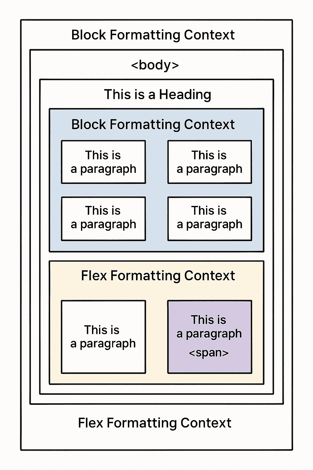
Here’s what the browser does:
- The
<html>element creates the root formatting context — the top-level coordinate system. - The
<body>,<h1>, and<ul>flow in the block formatting context, stacking vertically. - Each
<li>withdisplay:inline-blockcreates its own BFC, allowing them to sit side-by-side while containing their paragraphs internally. - The
<section>withdisplay: flexcreates a Flex Formatting Context, aligning its<p>children horizontally.
Conclusion — Thinking Like the Layout Engine
Once we start thinking like the browser, we will see invisible boundaries — BFCs, stacking contexts, compositing layers — and start using them deliberately.
When we know how:
- Formatting contexts isolate flow
- Stacking contexts define depth
- Compositing hands frames to the GPU
We stop guessing and start designing with the browser, not against it.
So next time our layout glitches or animation jitters, open DevTools, check "Layers" or "Performance," and ask: Did I trigger a reflow? A repaint? Or just a composite?
If we can answer that, we're already thinking like the browser.
Resources
A little bit of background reading to help you understand the browser's layout engine better.